NOA outdoor living NOA outdoor living
Theme story

What are the outdoor trend colours for summer 2025?

In today’s hectic world, people are looking to reduce mental stimulation by making their living environment more comfortable. This is where the new neutrals come into play. This summer, grey is the new brown although natural hues like green, blue and brown will obviously continue to be popular.

NOA partner

How are these trend colours used in Carpentier’s range?

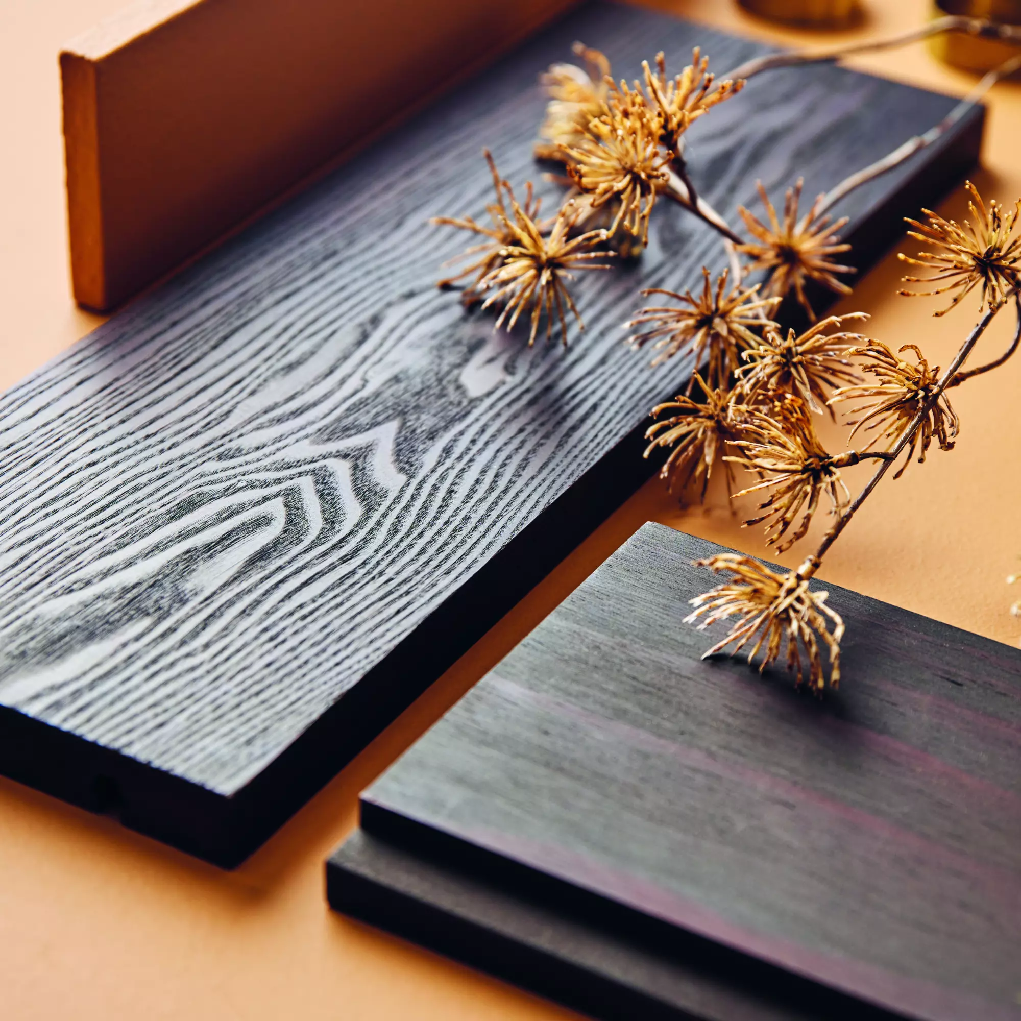
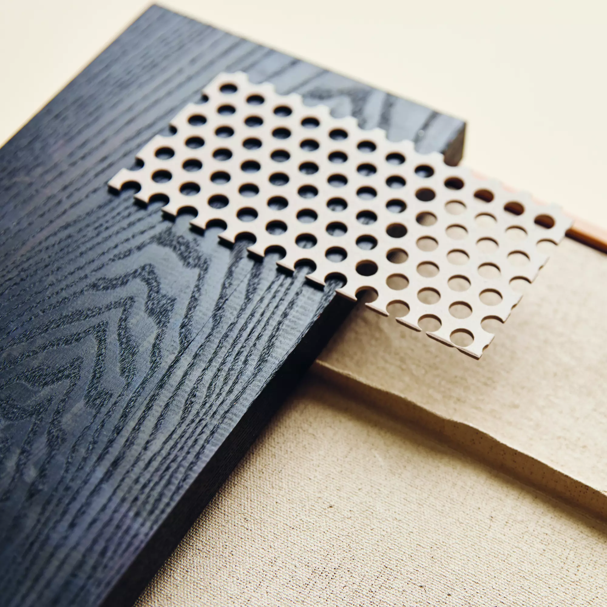
Because Carpentier’s products must stand the test of time, we have chosen to focus on the medium and long term, which led to the creation of four balanced colour groups. For Earthy Cool, we developed a series of classic shades with grey undertones, which have a slightly cooler feel, such as the more natural Dune or our soothing Taupe. Black continues to be a popular colour choice. In line with today’s trends, however, we came up with a line of slightly softer Off Blacks. Although they are not pure black, they gain depth when combined with a green undertone. Green is the star of our Boldly Chic line, with a crisp Matcha and the greyish-green Emeraude. The fourth colour group is Shades of Brown, which is dominated by warm earthy tones and browns. This category references to nature and wood as a colour in a subtle nod to sustainability. It includes a burnt Wenge, Espresso, which is a deep, natural brown hue and Bison, which is perfect for clean, minimalist but sophisticated designs.
How do you go about choosing the right colour for your outdoor space?

You can match the colours to your interior to create a relationship between your indoor and outdoor space. However, the right colour palette is often influenced by your living environment. In wooded areas, earthy tones, greens or off-whites will work better, while a water feature requires greyish-blues. At the same time, you also need to take light into account to create balance and harmony. A good rule of thumb is the 60/30/10 equation. Sixty percent of your design is determined by the natural environment, 30 percent by the walls, floors and furniture, and 10 percent by the accessories. Whereas you should prioritise key colours for the first two - which only change very gradually over time, you can go with something bolder and more topical for the latter.

Can you also use brighter colours in outdoor spaces?

Colour is trending and will continue to do so in the years to come. Premium brands need to respond to this trend. Moreover, the new colour palette means you can expand your range, allowing architects and landscape designers to take their projects to the next level. The new colours have even more depth. As a result, they will always look subtly different depending on the amount of (natural) light. This variety also contributes to a more intense experience of your outdoor space.

About NOA:
NOA outdoor living is an experience park for outdoor design in Kruisem. In the theme gardens, you can find inspiration to decorate your garden. These gardens combine architecture, landscape, and interior, and welcome architects, landscape architects, designers, and contractors as well as private prospects. In this inspiration park, you will find luxurious garden furniture and designs by more than 25 high-end partners, who are happy to advise you as you bring your dream garden to life. Moreover, the park is the perfect professional networking location; the conference rooms, covered patio, spacious showroom, and plaza of NOA outdoor living are the ideal setting for your conference, product presentation, or product launch.

Prev Return to overview
PLAN YOUR EXPERIENCE
×